- Improve your website

- Improve your website
Your website's partner, sponsor, and/or supporter logo grid should look good
It's typical to include the logos of your nonprofit's corporate partners, sponsors, and/or supporters on your website. You showcase their brands to say thanks, give credit, and to give your own brand a boost. It's a small detail, but how you present this collection of logos matters.
It matters to two critical audiences: your existing partners; and potential partners.
A well done logo grid expresses respect, gratitude, and care. It elicits a feeling of trust in your organization. When a logo grid is not presented well the opposite can happen. It degrades trust and can lead to a negative brand impression of your organization.
Example logo grid patterns
The following examples are based on real examples that have been recreated.
Logo grids that could use some work
Problems in grids can vary notably. We’ve see all the following and more.
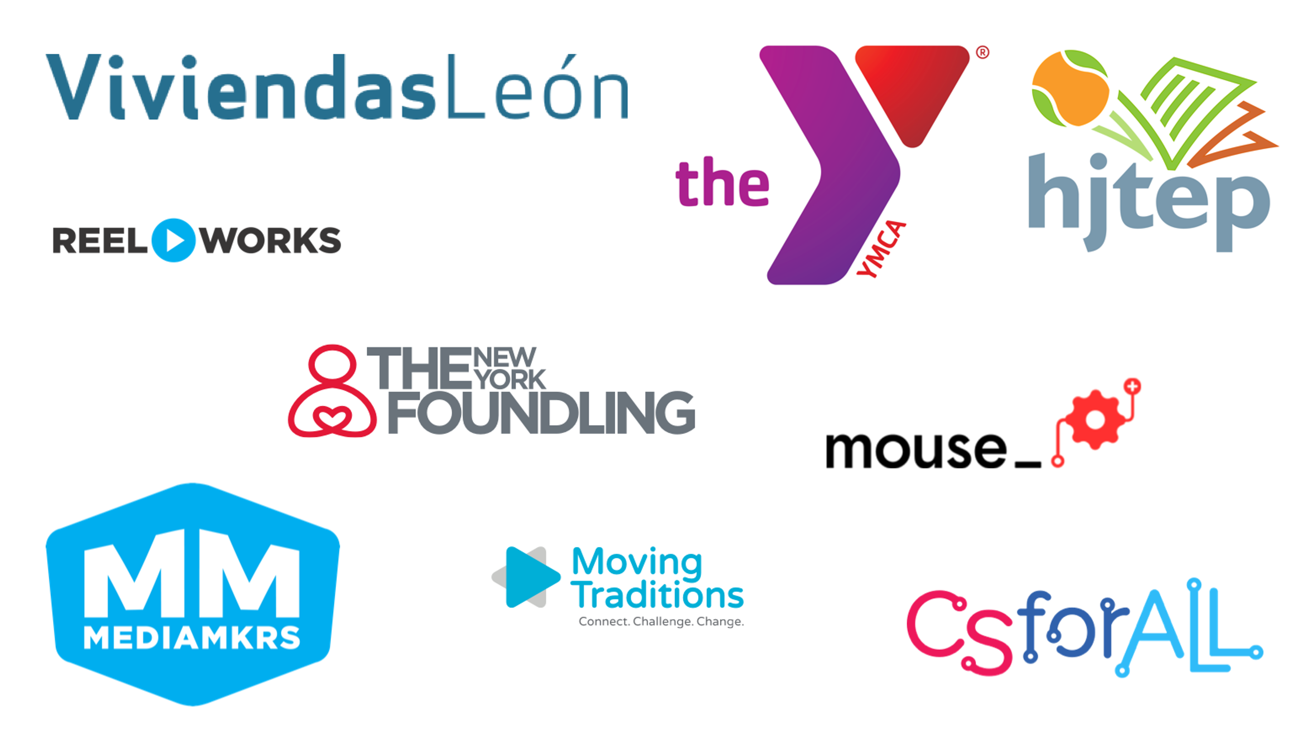
- An egregiously large logo next to a small one might that suggests one is more important than another when it shouldn’t.
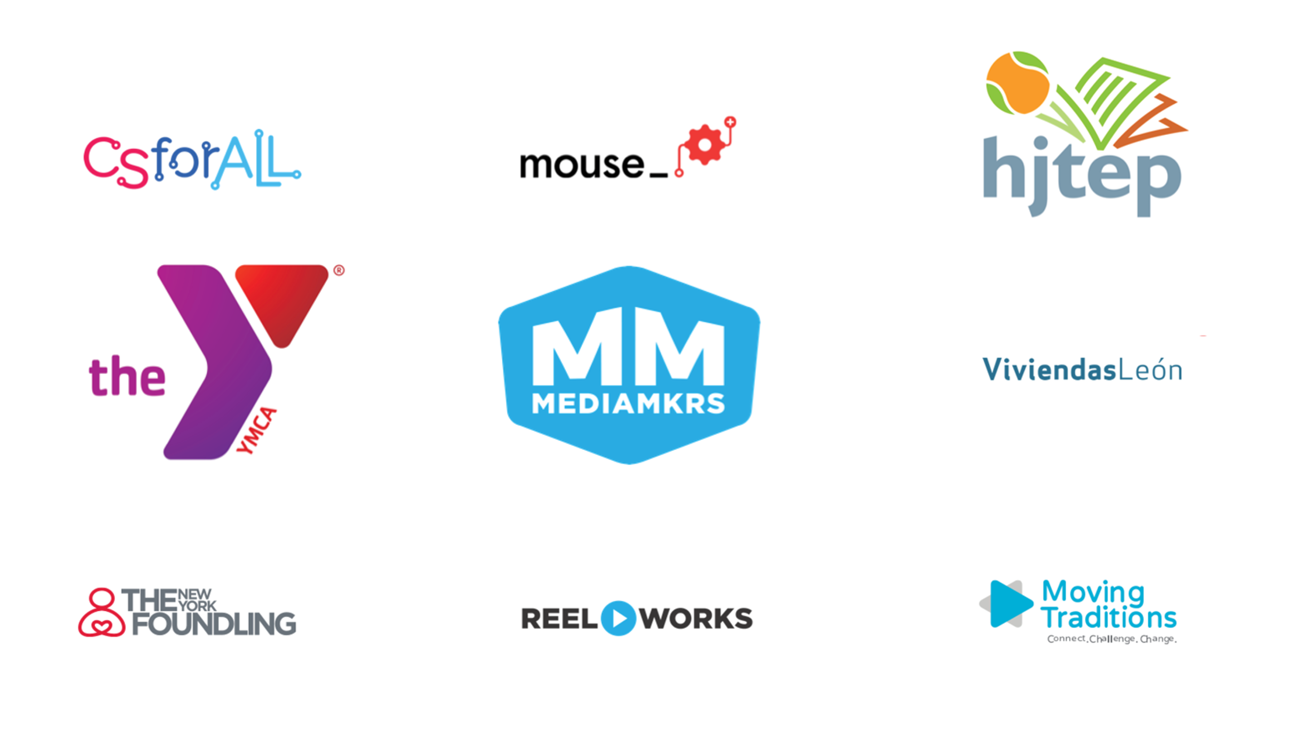
- Logos that are not evenly spaced making the grid hard to scan and appear messy.
- Logo graphics that are pixelated, warped or not cropped well.

Without a consistent size and amount of spacing around each logo some of them get lost while others really stand out. Which ones do you notice more than others?

While all of the logos are the same width, they are not given the same presence due to their varying shapes and sizes. Notice which logos your eye focuses on and which fade into the background. Assuming all should have equal presence, this is problematic.
A strong logo grid example
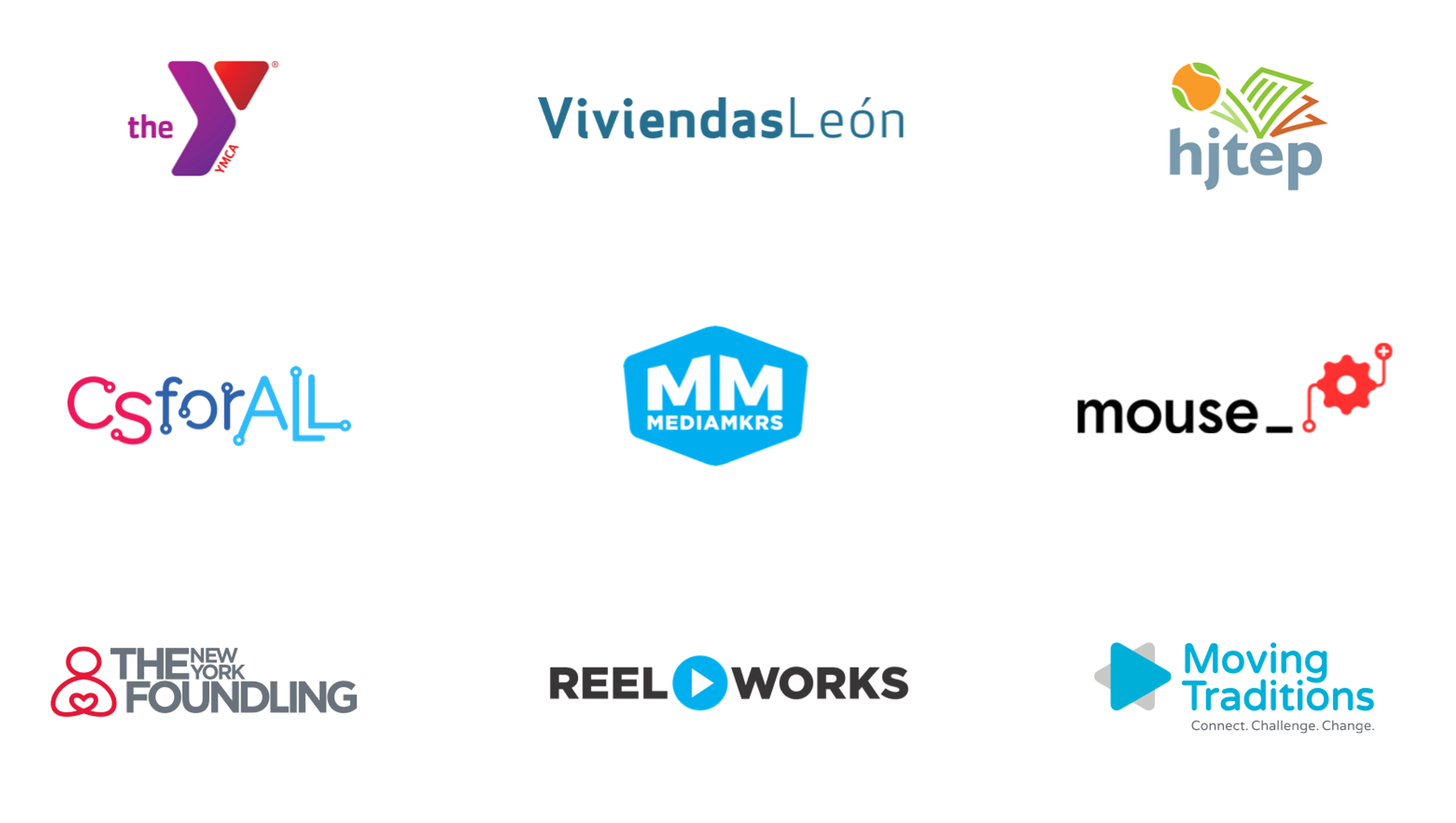
An effective logo grid delivers a consistent and balanced presentation. Logos are well spaced and sized. The grid is easier to scan without logos competing for your eye’s focus.

The logos in this grid are evenly spaced and each logo is well-proportioned, regardless of their varying shapes and sizes.
Logos are not all created equal
What makes a logo grid challenging starts with the variability in the logo graphic. Some logos are horizontally oriented. Others are vertical. Some have a lot of space around them and some do not. Some have a small amount of text and are easy to read. Some have a longer amount.
We often find we need to work with the files we receive from the partners of our clients to get them just right. Here are some tips from our experience.
Tips for working with logo files and preparing them to be used in a grid
- Have simple instructions for how you'd like the logo files to share with your sponsor/supporter. Include the size of the file you need. We often want to make sure the file we get is a high resolution file. Note if you prefer a particular variation, such as a black or white version as opposed to full color. You may not always receive what you ask for though.
- Edit all your logo files so they are all close in size. Make sure the logo mark is centered both vertically and horizontally in your final graphic.
- Find the right balance of white space. If there is a lot of extra white space around a logo, crop it tighter. Do keep in mind that not all white space is bad. Sometimes you need some white space to help balance one mark's size compared to others.
- Logos are generally made of type and illustrative elements. Save these as .png files to use on your website to help preserve their sharp lines and colors.
- Review your grid of logos as a whole. Sometimes you might have to adjust your whitespace and cropping of a logo to adjust the marks size to balance with other logos.
Asset preparation works alongside good website code to make a great logo grid come to life on your website. We use CSS grid or flexbox and the collection of related spacing options available in CSS to create our logo grids.
This article by Ahmad Shadeed has some nice tips for coding a grid of logos using flexbox so it looks polished. It highlights approaches and thinking we have employed over the years.
Simple design is not always simple but it is often worth it
Designing and coding a grid of logos may seem like a simple task, but there is a bit of craft to it. Keep in mind that treating your supporters' brands well is also a reflection of your brand. A logo grid is one of those design elements that merits attention to detail. These details, when polished add to building a positive brand experience for you.
A design partner where details matter
More Articles
- Strengthen your communications & fundraising
How to promote your nonprofit event with a focused email series
- Strengthen your communications & fundraising
A thoughtful approach to nonprofit event branding
Ideas for small teams doing big things in the social sector
Subscribe to get ideas that blend design, strategy, and technology to help you build your brand, improve your website, and strengthen your communications and fundraising.
SubscribeBrought to you by MOD-Lab
At MOD-Lab, we're the thoughtful design partner for small teams like yours doing big things in the social sector. We create memorable branding, design materials, and websites that showcase the quality of your work and reflect your true impact.


