- Expand Your Marketing and Outreach
- Expand Your Marketing and Outreach
Building a visual language from your nonprofit’s logo
Every logo contains design opportunities waiting to be discovered.
When we work with organizations, we love finding design opportunities within their logo. It doesn’t matter if we created it or inherited it. There's an element of creative play that happens when we discover details in a logo and experiment with how those elements can become design tools to enhance other assets.
How visual language works
Think of your logo's individual elements as a inspiration. The shapes, angles, patterns, colors, and treatments within your logo become design tools that can be applied thoughtfully across different contexts.
When done well, there is an intuitiveness in being able to recognize elements in a website, brochure, and/or report that connect to the logo. These connections are a foundation of a visual language.
The Spark Kindness spark
For Spark Kindness, we created a new logo treatment with a playful spark icon. We had a lot of fun with the spark icon as a dynamic background element in page headers, calls to action, and more. This creates visual connection and energy throughout the website that builds on the overall identity of Spark Kindness. It reinforces their mission of inspiring positive action that is inviting and warm.
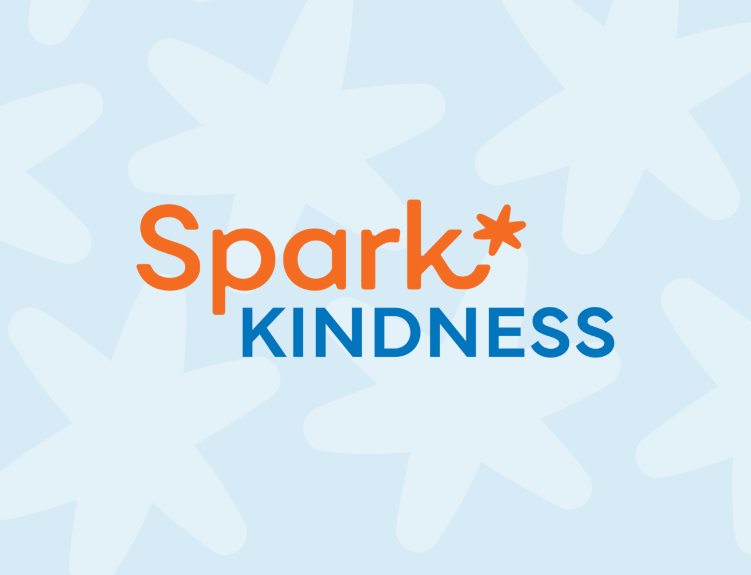
Spark Kindness Logo
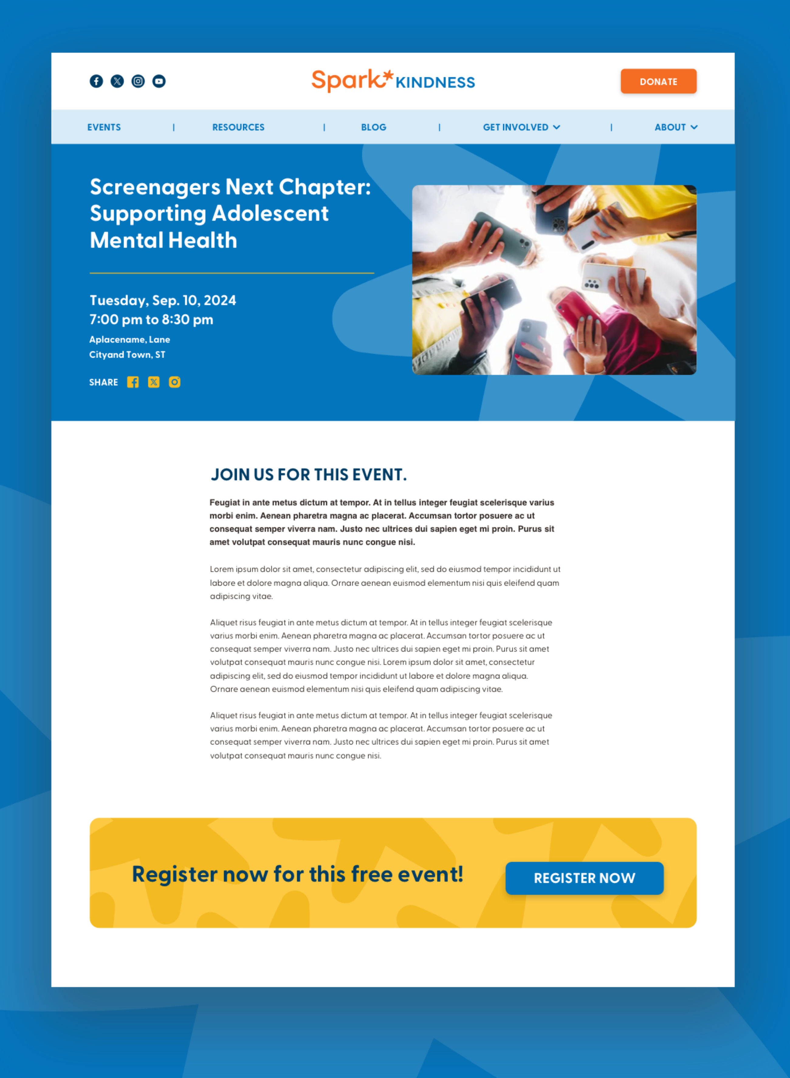
Page from sparkkindness.org showing the use of the spark icon in the header and call to action.
The WeRobotics frames
With an existing logo like WeRobotics, we found opportunity in the distinctive frame corners, extending them to create image treatments throughout their new website. We also added some roundness to the opposite corners of the frames, where the letters in their name are used in the logo. This was applied to our image and card treatments.
We also extended the idea of the lines in the logo as representative of paths. We introduced dotted line patterns in background treatments — a playful element that connects to mapping and flight patterns central to their drone technology work.
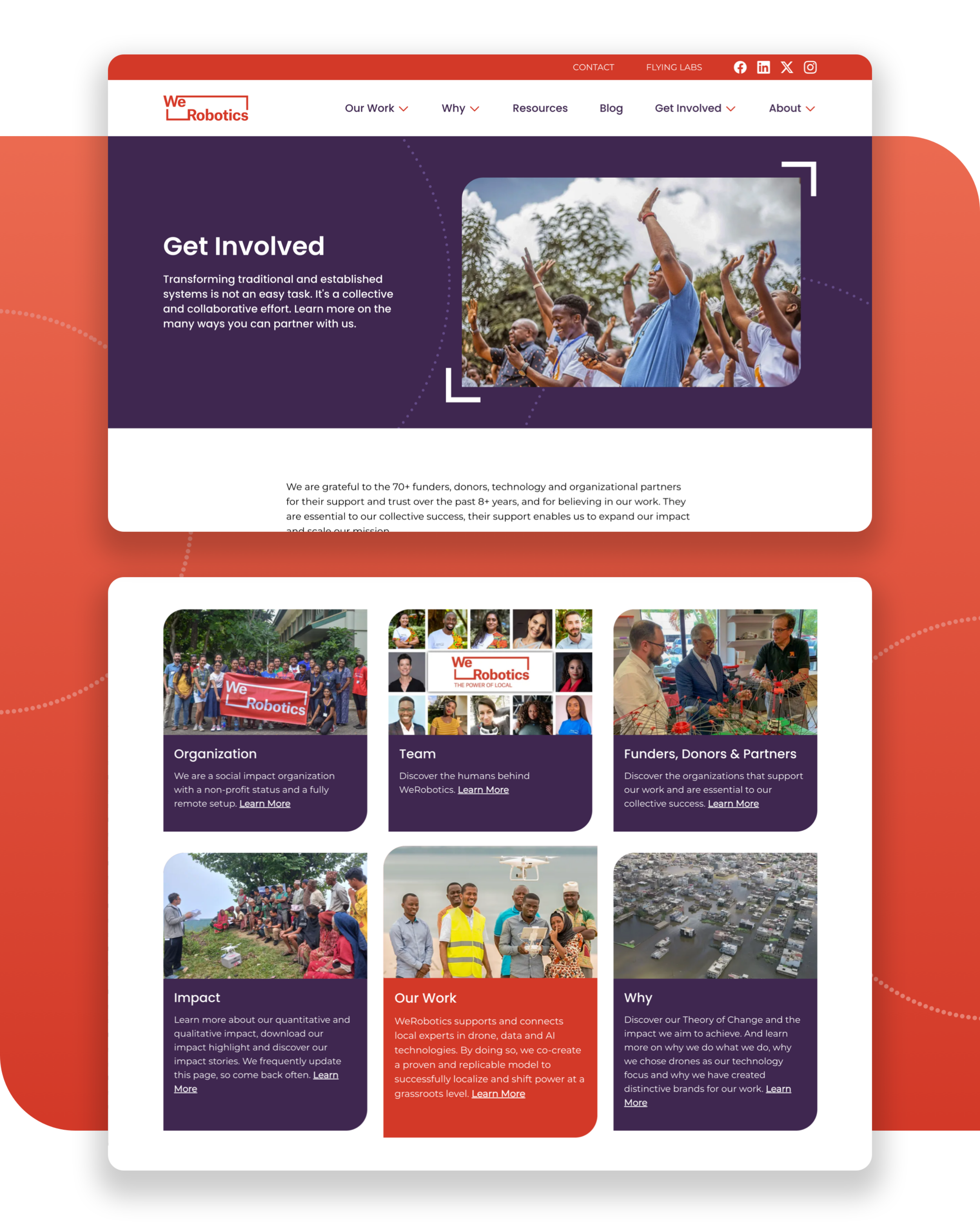
A page from the werobotics.org showing use of framed and rounded corners on images and cards inspired by the logo.
The Coast Guard Foundation shield and angles
Coast Guard Foundation's shield mark is a great example of how simplifying a logo can open up a wealth of creative and impactful possibilities. We simplified and modernized the Foundation’s logo and in doing so were able to explore it in a number of ways. It works beautifully as a background element and also an icon for call out sections on their website. The angles and stripes from their revised logo stand out more. They inspired image treatments and even how navigation elements are divided on their site.
Because the logo is simpler, the design elements inspired by it connect more clearly to the logo mark. You can recognize the colors, the striped angle, and shape of the shield. This is what helps create a visual language that is recognizable as the Coast Guard Foundation.
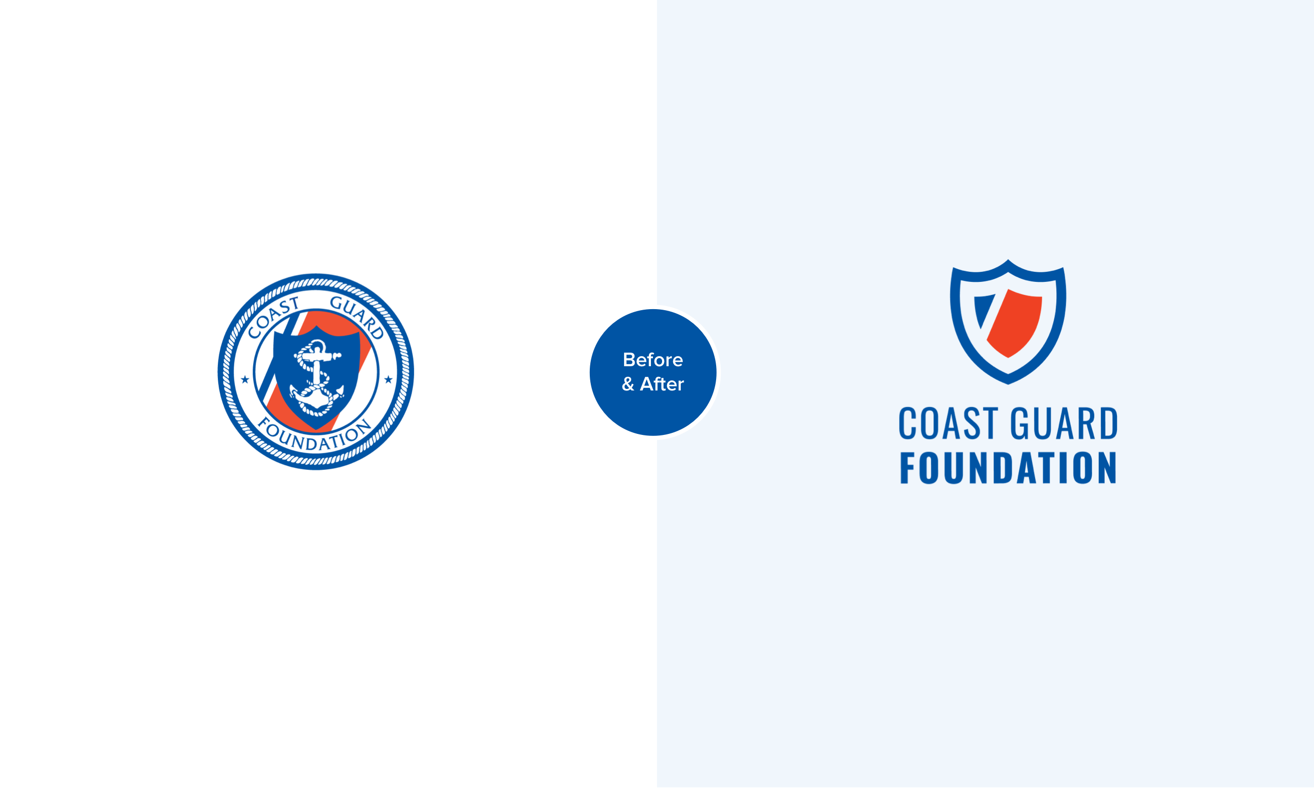
A before and after for the new Coast Guard Foundation logo.
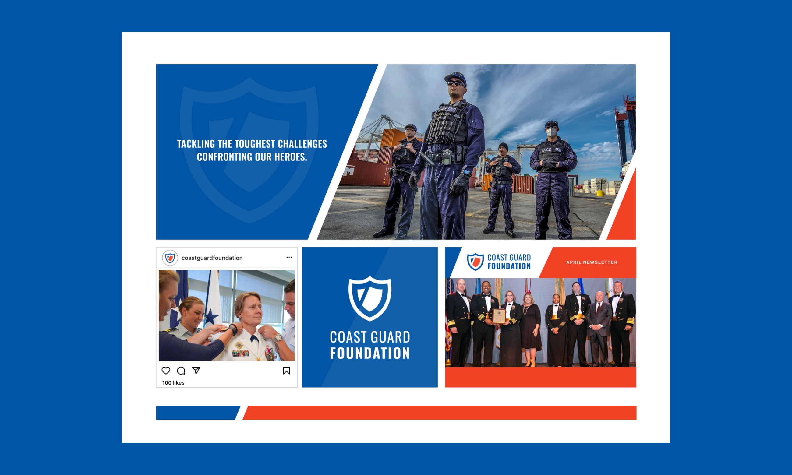
Mood board showing how elements of the logo can be used in different context to help create a visual language.
Why using elements of a logo creates stronger design
This approach does several important things for your organization:
- Builds recognition beyond your logo. When design elements repeat across materials, people develop familiarity with your visual style that extends your brand presence.
- Creates professional cohesiveness. Materials feel connected and intentional, which builds trust with your audience.
- Provides creative efficiency. Having a visual language gives designers and your team a framework that inspires creativity while maintaining consistency.
- Reflects your mission visually. The best visual languages connect to what your organization actually does.
Planning for a visual language
Your goal is to have a visual language where every design element works together to help tell your organization's story with recognizable consistency, creativity, and impact.
For your next brand project, it's important to have a budget and process for applying your logo beyond just having the mark itself. This can be done in any number of ways. We do this through the creation of a mood board and style guide that includes representative examples of the application of logo to various design elements and materials. We also often pair a branding project with a needed material. This could be something smaller like a brochure or marketing one-sheet or larger like a website or annual report.
The key detail is to create an opportunity for you and your design team to strategically play with the logo elements to find the best way to create an impactful visual language. This investment helps you see and use the full potential of your visual identity from the start.
More Articles
- Expand Your Marketing and Outreach
Why empty space isn't wasted space: A guide for nonprofit communicators
- Expand Your Marketing and Outreach
Announcing a new design? Don’t just launch—tell the story
Mightier Newsletter
Join our community of nonprofiteers and the partners that support them. Our monthly newsletter includes resources with small and mighty teams in the social sector in mind – sharing tips to help with content creation, website use, marketing, and more.
SubscribeBrought to you by MOD-Lab
At MOD-Lab, we're the thoughtful design partner for small teams like yours doing big things in the social sector. We create memorable branding, design materials, and websites that showcase the quality of your work and reflect your true impact.
