- Build your brand

- Build your brand
Why empty space isn't wasted space: A guide for nonprofit communicators
Picture this: You're reviewing proofs for your annual report, and someone on your team suggests adding more program photos to fill the "empty" space around your impact statistics. Or you're in a board meeting where a member questions why your new website has so much "wasted space" when you could fit more information about your services. Sound familiar?
This tension between maximizing content and allowing breathing room plays out regularly when reviewing a nonprofit’s designs. Strategic use of spacing can be the difference between a message that gets absorbed and one that gets overlooked. The research on white space reveals why this seemingly simple design choice has such powerful effects on how people receive and respond to your organization's message.
What is white space?
White space, also called negative space, refers to the empty areas in a design that don't contain text, images, or other visual elements. Despite its name, white space doesn't have to be white. It can be any color, texture, or pattern that provides visual breathing room around content.
The term "white space" has its roots in the printing and graphic design tradition. Printers historically used white paper as their standard background material, and the areas of paper that remained unprinted were called "white space." This connection to printing explains why the term persists today, even though modern designs use countless colors and digital backgrounds.
Margins and spacing serve practical and aesthetic purposes that remain relevant today. They provide room for people to hold materials without obscuring text, space for notes when needed, and visual relief that makes dense information more approachable. These same principles guide how we think about spacing in modern design.
White space isn't just about big empty areas. It's present in every design decision, from the spacing between letters in your logo to the margins around a donation button on your website.
How our brains process visual information
Visual perception studies show that "overly complex or cluttered interfaces can overwhelm users, which leads to confusion and frustration." When people encounter dense, packed layouts, they experience what researchers call increased "cognitive load" - the mental effort required to process and understand information.
White space reduces this cognitive burden by creating visual organization. It helps the brain separate different pieces of information and establishes clear pathways for the eye to follow. This isn't about aesthetics but rather respecting how human attention works.
For nonprofit communications, this has direct implications.
Every moment someone spends fighting through visual clutter is a moment they are not understanding your mission and connecting with your story.
The key insight: white space isn't empty at all. It's working space that helps your audience find what matters.
White space in your organization's materials
Annual reports and impact communications
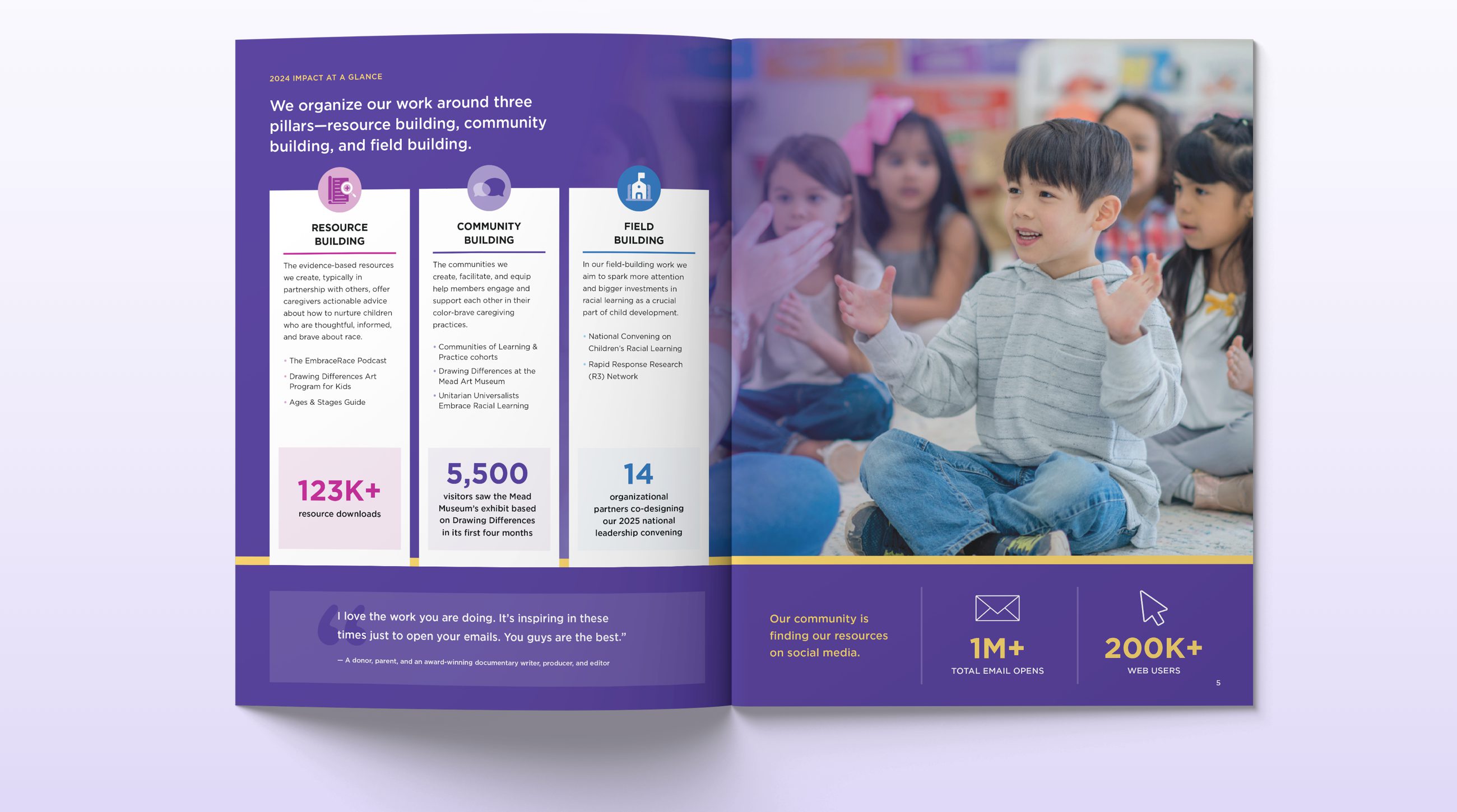
In printed materials like annual reports and impact summaries, white space creates visual hierarchy and guides attention. When you surround a powerful statistic with breathing room, it carries more visual weight than the same number buried in dense text. This principle applies whether you're highlighting program outcomes, featuring donor testimonials, or presenting your organization's mission statement.

Generous spacing around statistics and program descriptions helps readers quickly understand impact while creating a professional, trustworthy presentation.
Grant proposals and formal documents
The spacing in your grant proposals affects how program officers process your information. Research shows that readers' eyes naturally follow predictable patterns, and white space can direct this flow toward your most compelling arguments.
A well-spaced budget summary or program description respects the reviewer's time and cognitive capacity. When you're preparing grant applications, remember that reviewers often evaluate dozens of proposals. Materials that are easy to scan and understand have a practical advantage beyond just looking professional.
Remember that reviewers often evaluate dozens of proposals. Materials that are easy to scan and understand have a practical advantage beyond just looking professional.
Website pages
The debate over white space becomes particularly intense when discussing websites. The persistent fear that users won't scroll beyond "the fold" has led many organizations to cram content into the top of their pages. However, research from Nielsen Norman Group shows this fear is largely outdated.
While users do scroll more than they used to, the data reveals an important nuance: in studies conducted years apart, user attention shifted from 80% of viewing time spent in the first screenful to 81% spent in the first three screenfuls. This means the "fold" barrier has essentially moved down, but users still prioritize information that appears earlier on the page.
The key insight isn't that users will automatically scroll through any content, but that they need clear reasons to continue. A Software Usability Research Laboratory study found that users actually read long, scrolling pages faster than segmented or paginated content when the design supports their journey through the information.
What this means for your website pages: Your most important messages and calls to action should still appear early, but you don't need to cram everything above an arbitrary fold line. Instead, create compelling reasons for people to continue engaging, with strategic spacing that makes the journey feel worthwhile rather than overwhelming.

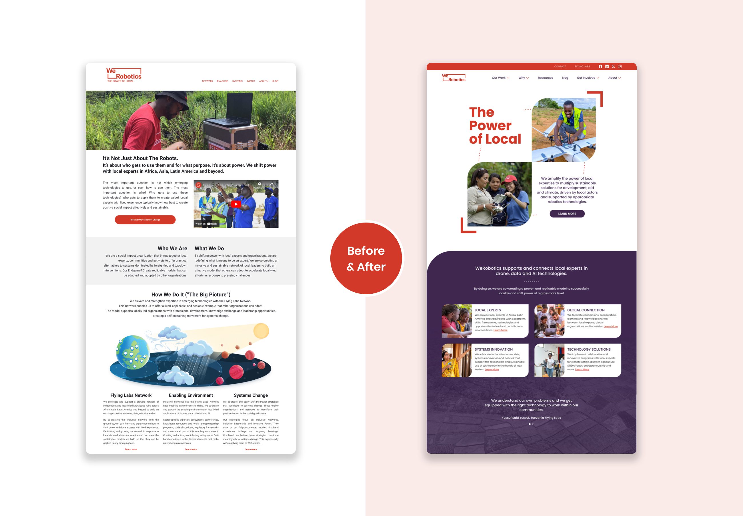
Strategic white space transforms dense content into clear, scannable information that guides visitors to key messages and calls to action.
Addressing common nonprofit concerns
"We can't afford to waste space"
This concern reflects a scarcity mindset that's understandable but counterproductive. White space isn't wasted any more than pauses in a speech are wasted time. Both create emphasis and comprehension.
Consider the real cost of cluttered communications: confused donors, overlooked calls to action, and materials that get discarded without engagement. Thoughtful spacing is actually an efficient resource use because it increases the effectiveness of every message you send.
"Our board thinks it looks empty"
Frame white space in terms of communication effectiveness, not aesthetics. Ask board members to identify the most important message on a page - if they can do this quickly, the design is working. You might also share examples of organizations they respect and point out how those materials use spacing to guide attention.
"Our volunteers or non-designer staff create our materials"
If you are not able to work with professional designers but want to maintain certain spacing standards, consider creating a content style guide. Simple guidelines can help volunteers and non-designers create more effective materials. It could include reminders like the following.
- Leave margins of at least one inch on all sides.
- Use headers to help create space in text heavy content and to help improve content scanning.
- Resist the urge to fill every inch of space.
The connection to mission impact
When you use strategic spacing to make your annual report more readable, you're helping donors understand their impact. When you create breathing room around your donation button, you're removing barriers between generous hearts and meaningful action.
Good design isn't vanity. It's stewardship.
This approach is actually part of inclusive practice. It acknowledges that people process information differently and creates multiple pathways for understanding, just as you might offer program information in different languages.
The goal isn't to use as much or as little white space as possible, but to use it purposefully. When someone questions the "empty space" in your materials, you can explain that it's not empty at all. It's working space that helps your audience find what matters and take the actions that advance your mission.
More Articles
- Improve your website
Are your nonprofit homepage headers saying nothing?
- Strengthen your communications & fundraising
How to promote your nonprofit event with a focused email series
Ideas for small teams doing big things in the social sector
Subscribe to get ideas that blend design, strategy, and technology to help you build your brand, improve your website, and strengthen your communications and fundraising.
SubscribeBrought to you by MOD-Lab
At MOD-Lab, we're the thoughtful design partner for small teams like yours doing big things in the social sector. We create memorable branding, design materials, and websites that showcase the quality of your work and reflect your true impact.


