- Build your brand
- Improve your website
A beautiful website inside as well as out
When you’re a carpenter making a beautiful chest of drawers, you’re not going to use a piece of plywood on the back, even though it faces the wall and nobody will ever see it. You’ll know it’s there, so you’re going to use a beautiful piece of wood on the back.
Steve Jobs
We are hired to create beautiful websites. Our websites need to showcase content and actions that make a positive impression on the people a nonprofit seeks to support and engage. But there are two sides to a website. There’s the frontend that everyone sees and the backend that powers it. Often the quality of a website is evaluated by its frontend. While the frontend is very important, the templates, code, hosting, and content management system (CMS) all have significant impact on how well a frontend comes together and facilitates making positive impressions for years to come.
Beauty on the outside needs to be paired with beauty inside.
The tools and services to power your website, most notably the CMS, need to deliver a site that meets the following criteria.
- It should be easy and a joy to use.
- It should help you tell your stories with confidence.
- It should help you improve your chances of ranking on Google and other search engines.
- It should be set up to maintain relevancy and be able to grow as your content and strategies evolve.
In this article, we will explore each of these criteria. We share our approach to them alongside the key tools we use.
How do we make a website that is easy and a joy to use?
A website that is beautiful on the inside makes editing content joyful. To start, we believe the look of your control panel should be professional, clean, and polished. It’s one of many reason we use Craft CMS. Its control panel is inviting and elicits good feelings. It presents a light look and welcoming interface that is not overwhelming.
Beyond Craft CMS’s excellent control panel design is how the editing interface can be customized and streamlined by us to further improve your authoring experience.
Both the clean look and the customizable interface contribute to making an easy to use content management system.
Designing your content editing experience
Our website technologies provide a host of ways for us to build the actual forms in the CMS’s control panel you use to create and edit your site content. We can design your content forms in a number of ways to make them intuitive and fit the specific content they are meant to help you control:
- We design each type of content to have only the fields that make sense for it to have. Whether a blog article or your homepage, your form reflects the content for that page only. There is no fluff or fields to ignore.
- We have a library of different field types from URL/Link, to different types of text areas, to relationship, to table fields to choose from. We select the field that is most appropriate for the content it will hold.
- We name the fields using labels that make sense to the content and you.
- We order the fields logically.
- We add headers and use dividers to create visual space and add additional context for your fields.
- We can even organize your fields into separate tabs.
- We add directions to specific fields and within sections of fields to lessen the need to have a long companion website guide to refer to.
The opportunity to thoughtfully and carefully customize each type of content’s editing form dramatically improves your authoring experience.
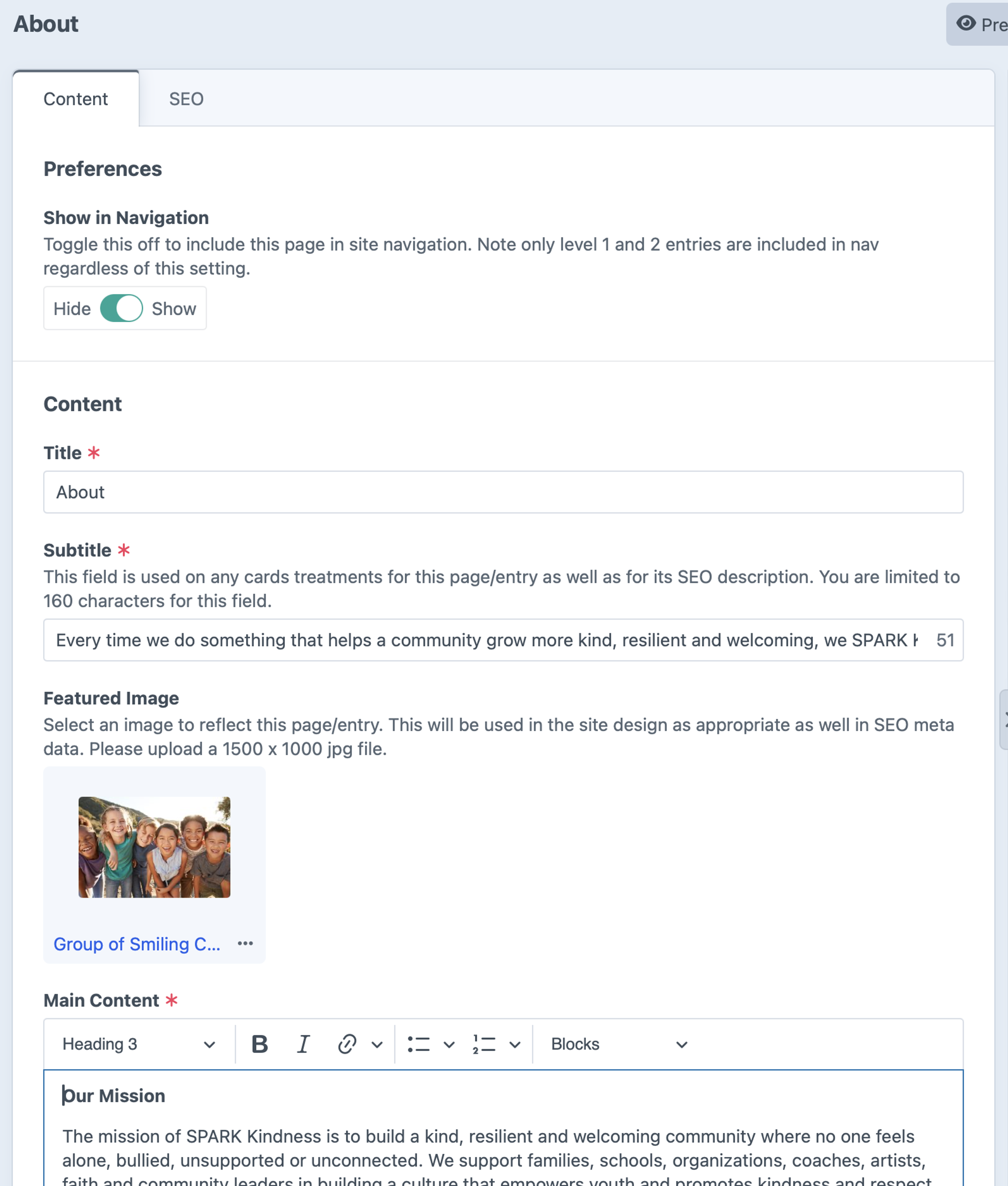
Example of the general page edit form of www.sparkkindness.org. It shows our use of inline directions for the “Show in Navigation”, “Subtitle”, and “Featured Image” fields. We use dividers and headers to separate “Preferences” from “Content” to create context for the field groups. These are just some of the features of Craft CMS we employed to make this edit form easy to use.
Thoughtful content modeling is essential to make an easy-to-use website
A content model describes how all of the different types of information come together to design the website's content management. A well architected content model considers the frontend goals and how content will be worked with in the backend. It can make working with your content easier for authors. It can also simplify how web developers build your website.
Craft CMS lets us model content in so many different ways. We can create different types of content and custom fields, and we can relate that content to each other, to power categories, to feature related content, and more. All of this can be done out of the box without the need of any third-party plugins.
We aim to use the flexibility offered to create the simplest content model possible for your website. The fewer the fields and the more consistently they are applied the better. We work hard to find the similarities and differences of your different types of website content — all in an effort to thoughtfully streamline the model.
For example, on many of our website builds, we find that including subtitle and featured image fields along with the page title on just about all pages/entries of a site is a powerful approach. These content can serve multiple purposes including the following:
- Card representations of the content, like a grid of featured pages or list of blog entries.
- Masthead content used on the top of their individual pages.
- Meta data for search engine optimization (which will be described later in this article)
This is an example of finding similarities among content and making your content editing experience predictable while at the same time powerful. Focusing on three fields for your pages/entries impacts a host of critical presentations of that page/entry throughout your website.
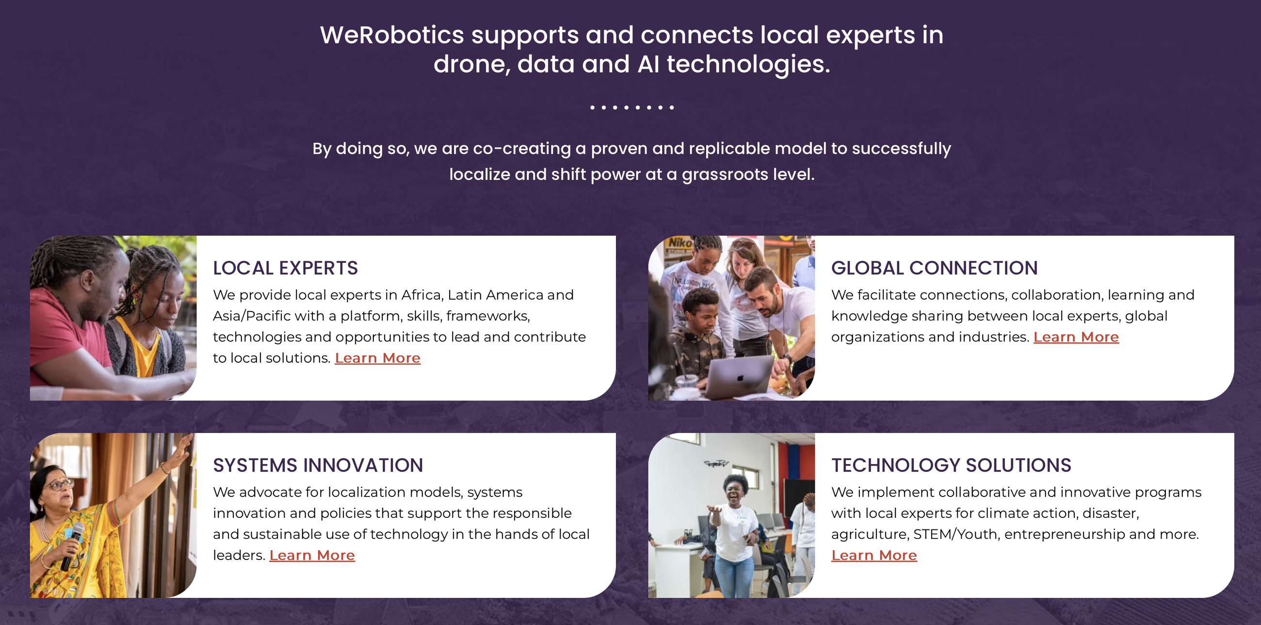
A grid of page cards on werobotics.org that use the title, subtitle, and featured image.
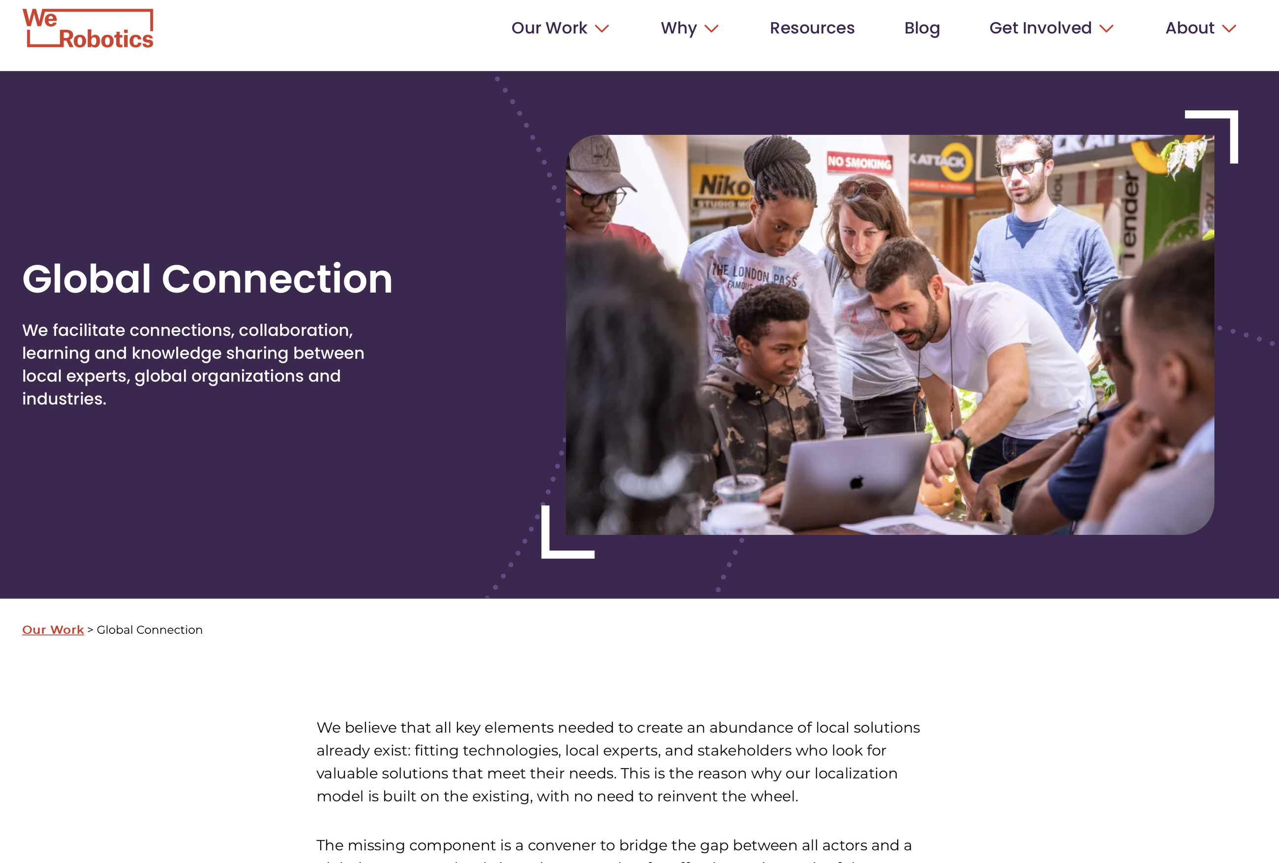
The title, subtitle, and featured image used in the hero of the page.

The title and subtitle fields are mapped to key SEO data to help ensure your page/entries have unique meta data.
When flexibility is used to make every page or feature unique, it can increase a site’s complexity. Managing such sites can be hard. We have inherited sites from clients, thoughtfully produced, but complicated due to how unique the handling of different content is. When supporting a site like this, we find even after years of getting to know it, we still have to review code and test things to understand how it does what it does to answer simple questions.
We work hard so our websites don’t result in such experiences for anyone. We thoughtfully consider how every detail and feature is set up with the goal of easy management for content authors and web designers/developers alike.
How do we architect a website to help you tell your stories?
A key purpose of your website is to tell your stories. Whether through a blog, event, or impact page, you need the flexibility to showcase your content for visitors to effectively access and consume it.
Designing your content with flexibility and brand in mind
Your content should always look great and be a confidence and trust boosting resource for your brand. And, you shouldn’t have to work hard to make it so. We deliver custom websites with intentional flexibility. Intentional flexibility is present in sites that do the following:
- they are uniquely built to handle the content and desired outcomes you are focused on;
- they have flexibility in the entry types and content blocks included;
- and they have guardrails to make staying on brand visually automatic.
We build websites with two key levels of content flexibility.
First, we can create different templates for pages called Entry Types. An entry type can have a unique edit form and a different design treatment. For example, in a blog you might have Article and Podcast entry types. The Podcast entry type may have extra fields to embed your episode audio player or select an extra category field for what season the entry is part of.
Second, we create content blocks. For most content types, we power the main content of a page with a rich text editor. We pair the rich text editor with a library of content blocks that you can flexibly add within your text. A content block is a unique content treatment, each with an intentional design. Common block types include:
- Image
- Logos
- People
- Callout / Quote
- Call to Action
- Metric
- Video
- Slider
You can add blocks in any order or amount. Each block has the right content fields and directions needed to complete them. Blocks are created to have a beautiful design treatment unique to each website we build. Getting the right design to display every time is automatic, there is no coding or technical wrangling need by your content authors.
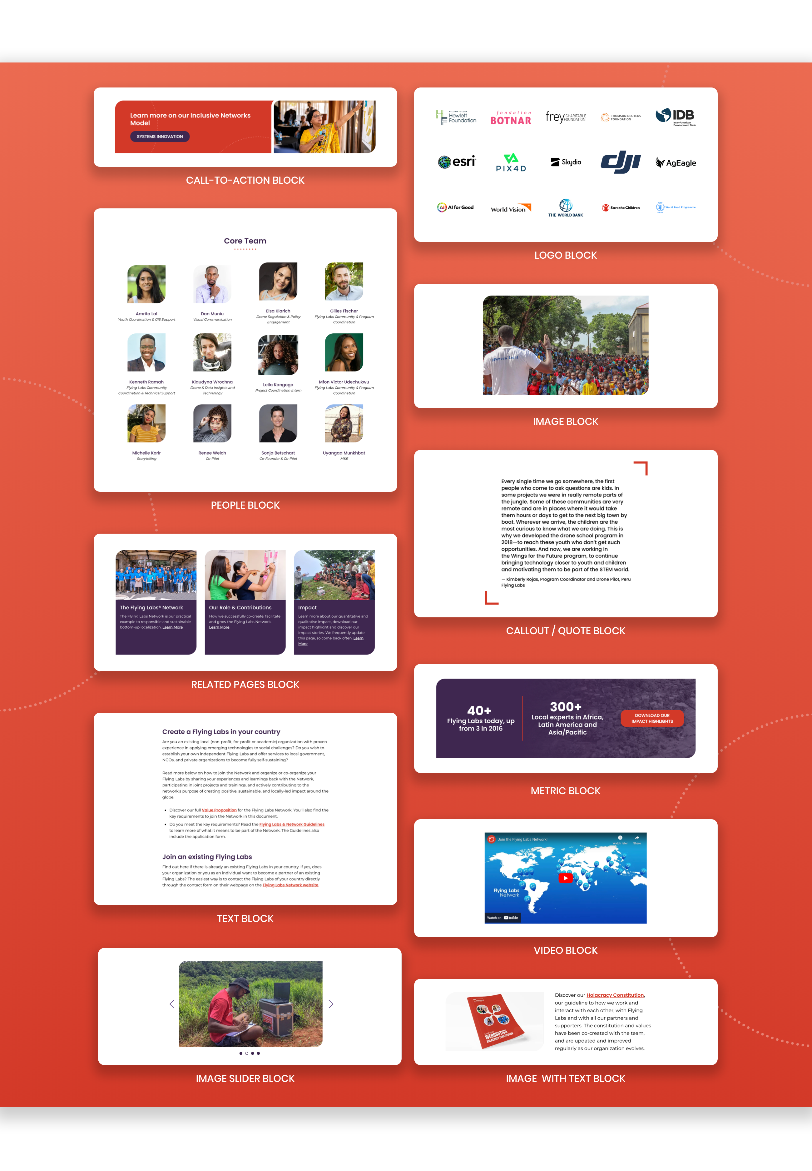
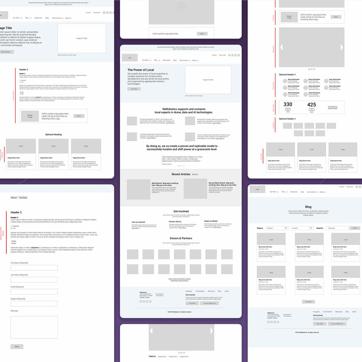
Collection of content blocks created for the werobotics.org website.
Previewing your content to see just how it looks before it goes live is a superpower
Out of the box, Craft CMS has a wonderful preview feature that shows you how a page will look before you publish it. With a click of the preview button on your edit screen, your form slides to the left and a window that shows how your page will look to the public slides in to the right. You can keep editing your page content in the left-hand form and the right display will update to show your changes in near real-time.
This is a wonderful feature that helps you design your content to best tell your stories.
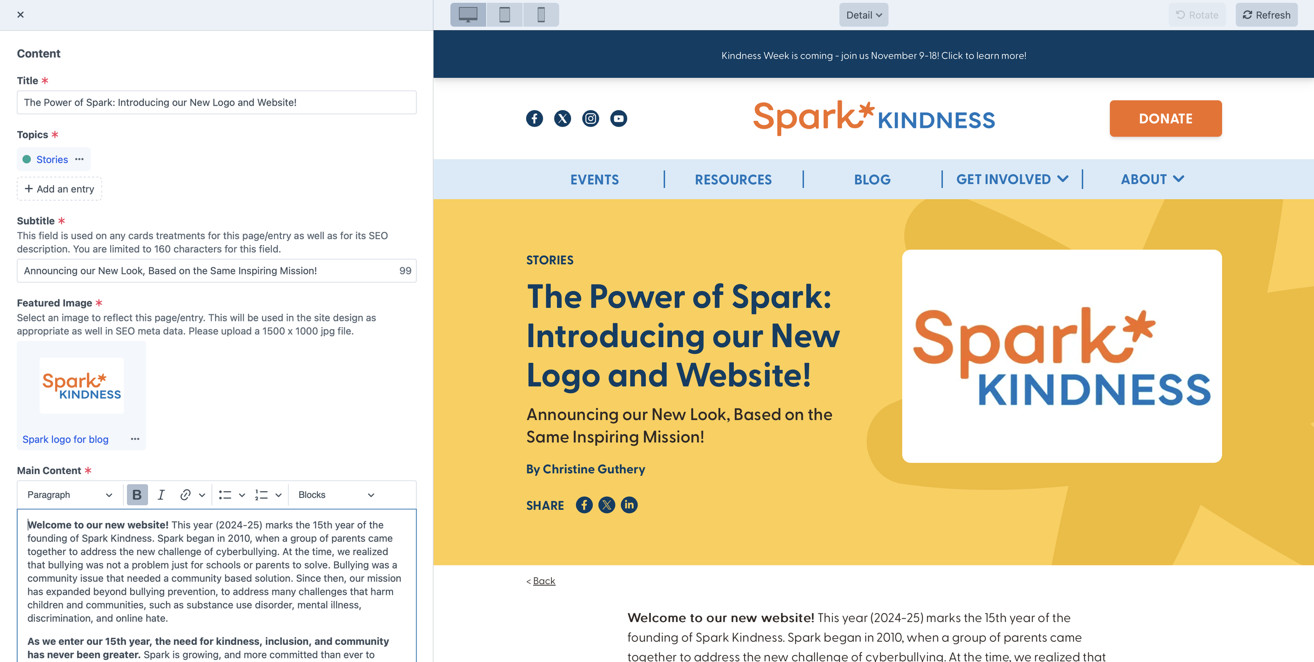
An example of using preview to show what an article page on sparkkindess.org looks like.
How should your website be built to improve your chances of ranking on Google?
What good is a beautiful website and amazing content if no one sees it? There are many factors for helping content rank better in search engines. It starts with great content and many author controlled efforts. This said, there are technical details, addressed through the code and hosting of a website that are important as well.
Meta data and performance are important criteria for technical search engine optimization (SEO). Ideally, you want to have unique metadata for each page of a website. You also want to optimize your images and pair with thoughtful hosting for great performance.
Using the SEOMatic Plugin for Craft CMS helps search engines get to know your content
SEOMatic is a tool we use on our Craft CMS websites that powers your SEO metadata as well as sitemaps. Both are used by search engines to understand your content. This plugin has a powerful inheritance model to help us automate the application of thoughtful SEO data and allow authors to override these defaults when desired.
We start by setting site-wide default SEO content. Then we set automated defaults by content section (blog articles, events, general pages, …). The content section meta will be used if available, otherwise the page will fall back to the site defaults. Finally, an author can override automated defaults on a per page/entry basis as needed.
This plugin is excellent at so many SEO related tasks, but to maximize the automation opportunities, it takes thoughtful hands to apply. As detailed earlier in the article, many of our site builds include a subtitle field and a featured image (whenever possible) along with the page/entry title on all or most pages/entries. These three fields are mapped as your content section’s key SEO metadata defaults.
- Title → SEO Title
- Subtitle → SEO Description
- Featured Image → SEO Image
For many site authors it is hard to remember to craft SEO data uniquely for every piece of content they publish. With our approach, we use the title, subtitle, and featured image to set some logical defaults that make sense for SEO. Of course, if you want to have different SEO content instead of these defaults, you certainly can provide them.
This is a great example of an efficient technology and thoughtful content modeling to deliver a website that works for you.
Using a redirect tool is helpful for SEO
When a URL or web address for a page on your website changes and someone visits the old address, they will get a 404 error (page cannot be found). If this happens with links that a search engine associates with your site, that search engine is not going to be happy. Its job is to connect quality, active content to its user’s query.
There are two common scenarios when URLs for your page content may change.
- You might want to change the slug for a page. The slug is an identifier for the page that is part of the address. For example, in an address of https://example.com/about/mission, “mission” is a slug for the mission page.
- When doing a website redesign, it is common for the URL structure of a site to change. For example, https://example.com/blog/ARTICLE-SLUG may change to https://example.com/news/ARTICLE-SLUG.
The solution to this challenge is to redirect old URLs to new ones.
Our second, go-to plugin, for our website builds is Retour. This tool helps with addressing redirect rules when the URL or web address of a page on your site changes. It works behind the scenes to automatically create a redirect rule when a slug changes. It also can be used to create a rule to handle situations where your structure changes — like changing from /blog/ to /news/. Finally, it tracks requests for pages to your site that result in 404 errors. These can be monitored to apply redirect rules for URLs that need to be fixed.
This is a great set of features to help ensure folks who want to land on your pages do .
Making your website fast for SEO and a great user experience
Your website needs to be speedy on all types of devices to deliver a quality experience. This is true for the people browsing your website and for the search engines that decide when your pages should be included in their results.
There are a number of practices we employ to help a site perform well.
- We keep our codebase lean. The code we use to style, animate, and add splashes of dynamism to a website are optimized well to not unduly add to a page's download size and rendering time.
- We optimize your website images. Our image component takes advantage of Craft’s optimization capabilities to resize, crop, and deliver images in modern formats. We balance good quality with small file sizes.
- We help with web hosting that can scale with your organization. We offer different tiers of hosting to match different hosting needs. Each tier considers and monitors performance and includes the ability to leverage content delivery networks and various caching technologies for sites that need it.
We have had fantastic feedback from partners on the greatly improved clarity of our work and beautiful design. We also had much feedback on the speed of the new website, especially in low-bandwidth countries where our previous website took up to 10 seconds to load, while the new version built with MOD-Lab takes less than a second.
Sonja Betschart, Co-Founder & Co-Pilot, WeRobotics
How can a website be set up to maintain relevancy and be able to grow as your content and strategies evolve?
Our websites are designed from the ground up to evolve over time. Our intentional flexibility model includes building our websites to efficiently empower our web designers and developers to manage and evolve the website.
We also pair our websites with a monthly website management or fractional design team plan to allow us to manage, evolve, and audit the site in collaboration with our client partners.
The model of redesigning your website and living with it for 3-5 years until you fundraise to redesign your website again is flawed. For most organizations this leads to websites that become less relevant, fast. Websites need to evolve to keep up with an organization’s changes in strategy, tactics, and audience needs.
A component-based approach to building a website makes all the difference
To make our websites easier to evolve, we create our site templates with a component-based mindset. What does this mean? Well, let’s look at an example. Let say a website presents a card style treatment to represent an article. This article card may show up in multiple places.
- The main blog page where a list of cards are displayed.
- A blog detail page where cards for related articles are shown on the bottom of the page.
- The homepage may showcase a few of the most recent articles as cards.
To support all of the above, we create an article card component. It includes code for not only the visual style of the card but also the content model that controls where dynamic data is displayed and how. This even includes code to address WCAG AA accessibility standards. Everything needed for the card to work is included in our component.
So now, when we want to make a change to our card in the future we can make it to one file and that change is made everywhere that card component is used. So adding an animation when someone moves their mouse over a card can be applied to the blog list, detail, and homepage more easily.
Another powerful example is our image component. Anywhere an image is used it is powered by a single component. This single file handles everything from image optimization, to responsive and accessibility treatments. Let’s say we want to add a new feature to support a caption under certain images on the website. We make the needed changes for our component and the new treatment can be made available to images on different page types and circumstances site-wide.
Components also help make the site easier to stay consistent. By having all treatments for an element in a single file, we can make sure that everywhere it is used, it looks and behaves just as it should.
Components save us development time and create opportunities to deliver more value in your website. Any time saved in development is better spent making high quality designs and conversion driven engagement opportunities.
Content blocks as components and for future proofing.
The content blocks you have available to build out the body of your pages are powered by our component approach as well. Because we use our content block approach as a whole across a variety of different page types on your site you also get a degree of future proofing. Here are some real world examples of changes we’ve made to existing blocks or new blocks that have been added to client libraries post launch.
- Add a caption to a video block.
- Revise a metric block to showcase more than one metric and a customizable button that could link to an impact page or report.
- Create an FAQ block to showcase frequently asked questions with an accordion treatment.
- Offer a block to dynamically showcase upcoming events.
Once changes like the above are launched they are made available wherever content blocks are being used on the site with no additional effort.
People make a website a powerful tool, technology helps support people in doing so
The people side of a website are what matter.
- The people that will visit the website
- The people that will take action through the website
- The people that will create and publish the content of the website
Our role is as the people that design, build, maintain, and evolve the website with and for you. We need to identify and pay meticulous attention to the needs of all the of people that the website serves including the people that help a website stay relevant and effective over time.
The frontend design blends attention to the needs of the visitors who will experience it and boosts the confidence of the organization it represents.
The backend needs every bit of attention to detail to empower content authors to tell their stories confidently and without any technical wrangling. It must to be able to evolve efficiently when new strategies, engagements, and content needs merit it.
We choose tools that help inspire and allow us to apply our thoughtful approach to building beautiful websites. We want the technology we employ to empower us, not give us something else to wrangle. It must afford us the time needed to devote to the human aspect of what we are doing — thinking and designing strategically to make the website work for all the people involved.
More Articles
- Build your brand
The Visual Brand Audit: Does your look match the quality of your work?
- Improve your website
Are your nonprofit homepage headers saying nothing?
Ideas for small teams doing big things in the social sector
Subscribe to get ideas that blend design, strategy, and technology to help you build your brand, improve your website, and strengthen your communications and fundraising.
SubscribeBrought to you by MOD-Lab
At MOD-Lab, we're the thoughtful design partner for small teams like yours doing big things in the social sector. We create memorable branding, design materials, and websites that showcase the quality of your work and reflect your true impact.


