- Build your brand

- Improve your website
Making nonprofit websites intuitive: the "Don't Make Me Think" principle
Your website communicates who you are, what you do, and how well you do it in so many ways. Your page content, navigation, design, and interactive experiences all express something about who you are.
In the early days of the web, Steve Krug penned a guide that revolutionized how we think about online experiences. His book, "Don't Make Me Think", although written in 2000, remains a seminal work for designers and developers. Its core message is simple: make websites as intuitive as possible. Nonprofits depend on communication and engagement to achieve mission. This principle is critical to making that happen well.
Imagine walking into a new community center for the first time. If everything is signposted clearly - from the main hall to the restrooms - you'd feel welcome and at ease. That's what Krug's principle seeks for websites. A great website is where users don't have to second-guess their actions or the content they're reading.
This article shares examples of applying this principal to your organization's website.
Why "Don't Make Me Think" Matters for Nonprofits
Clear Navigation is Key
Clear menus and well-labeled buttons are the signposts of the digital world. They guide users and help them find the information they need without hassle.

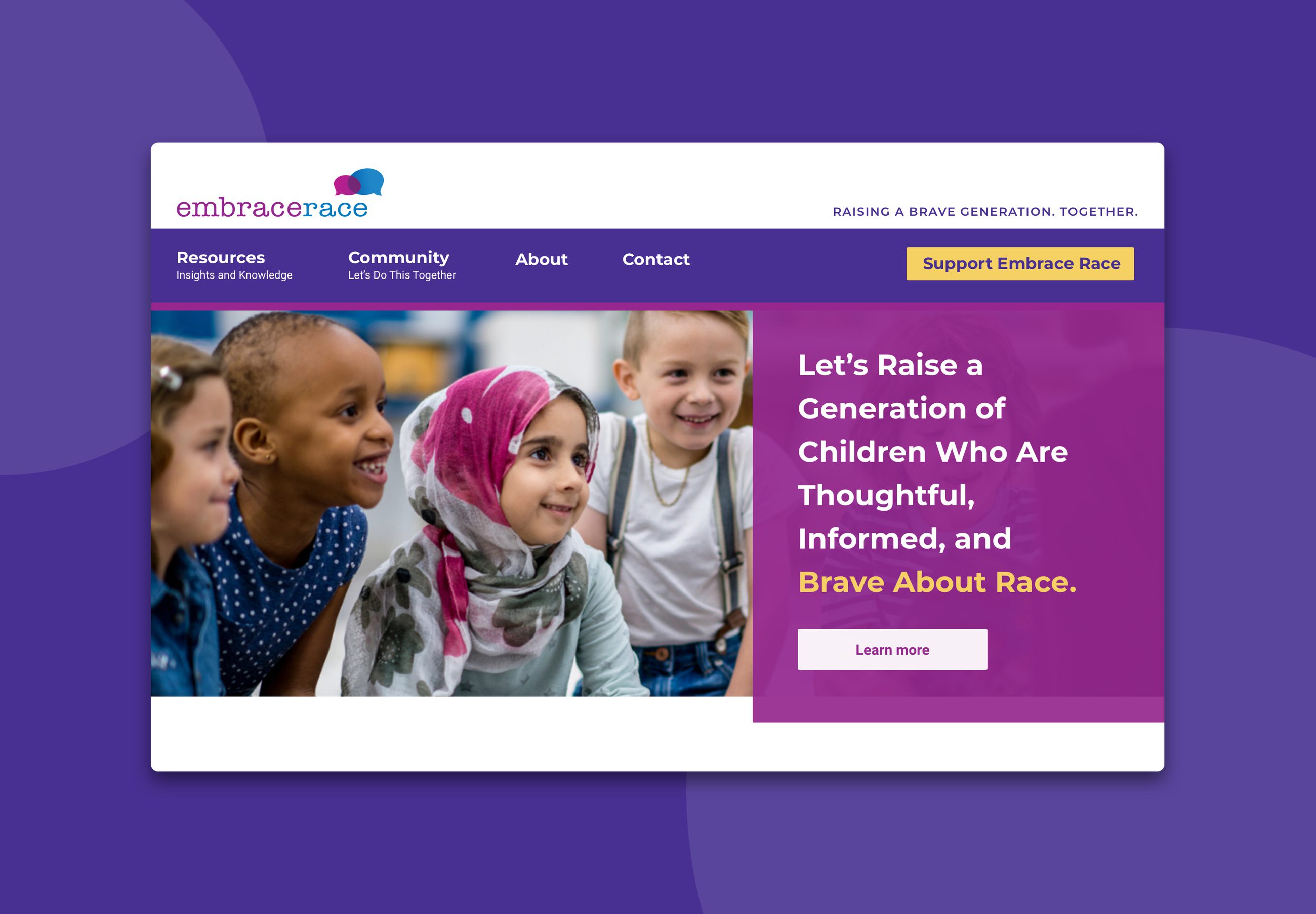
Simple and clear navigation at embracerace.org
When evaluating your navigation, consider conventions and the uniqueness of your labels.
There are conventions for naming labels in navigation that are familiar to visitors. "About", "contact", "programs", and/or "our work" are all common labels for navigation. They are boring. They are not branded. But, they are clear. Certainly, there are other clear words to convey what a site visitor may find in an area of a website. The goal is to make sure your navigation labels are not something a visitor has to figure out.
Consider a nonprofit dedicated to preserving local wildlife. Sections labeled "Our Mission," "Local Projects," and "Volunteer Opportunities" are direct and clear.
Review your website's navigation.
- Are the labels you are using clear and direct?
- Are any trying to use unique/branded language?
- Do your labels use or consider common conventions?
- Is there potential that a new visitor might not know what a label means? Is it something they might have to learn?
Content Should Connect Instantly
The text you write for your pages strives to connect your website visitors with your organization.
Simplified, direct text helps visitors grasp the essence and impact of your mission. Regardless of the education level of your audience, simple language wins.
If a visitor has to pause to think about a word's or complex sentence's meaning, there's a problem.
Explore writing tools that can evaluate your writing with a readability score. I used Hemingway Editor on a Mac for this article, which does just that. Strive for between a 5th and 7th grade reading level.
Review your website content.
- Is your website content written for your audience in the simplest language possible?
- What is the readability score for your key written work?
Embrace Simplicity
Every sentence and paragraph matters as individual communications. Every image you choose should matter. The layout of these content elements is also important.
Your layouts help you tell the story of the page. They weave together your content to express priority and a path to learn more.

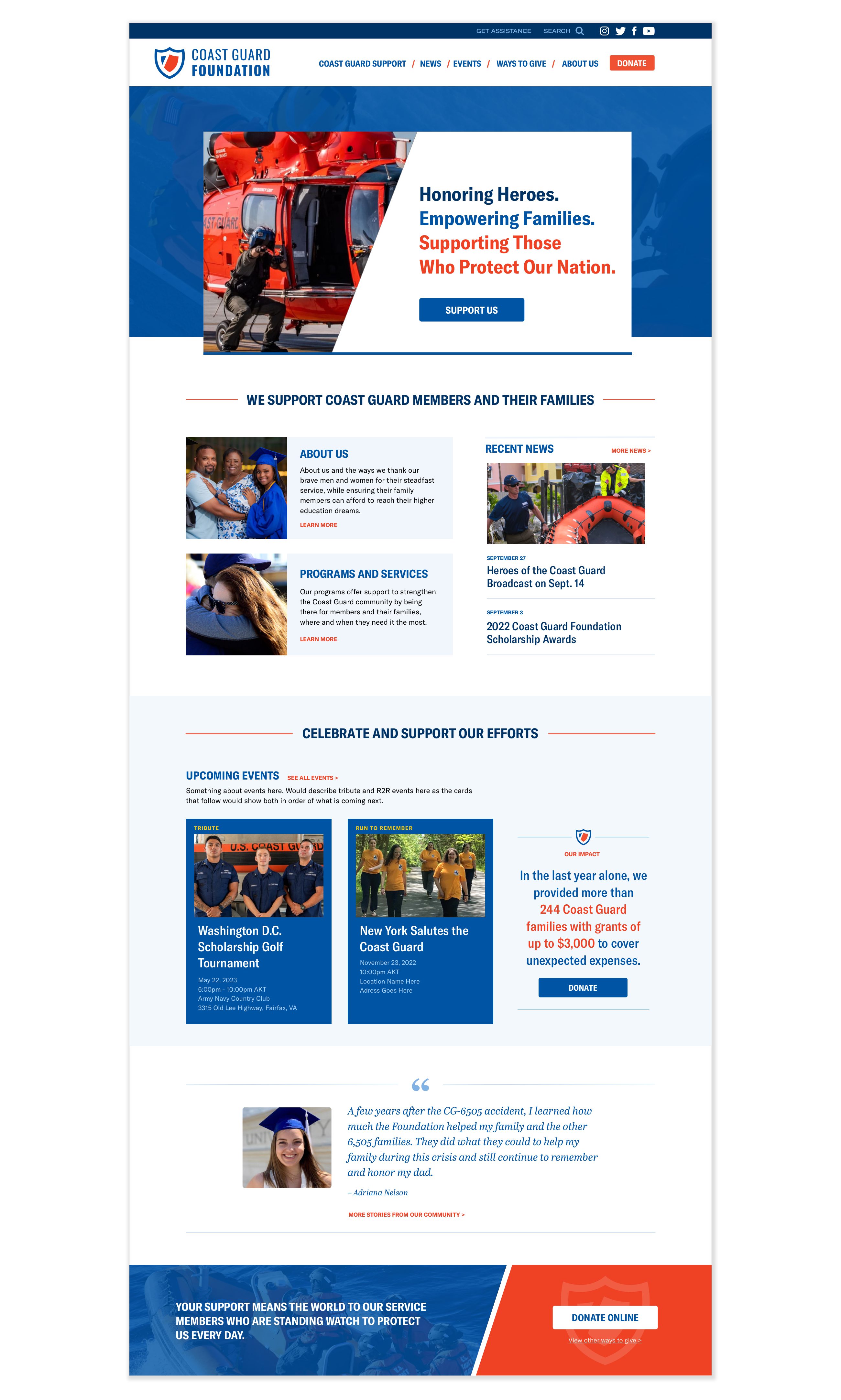
The homepage at coastguardfoundation.org showcases direct content and a layout that supports it
A clutter-free and organized layout lets visitors focus. Sections, headers, shape, and space create a map of what you have to share. They help someone scan the page.
Scanning content is so important on the web. Scanning allows a visitor to get the big picture of a page and to find the elements that are of most interest.
Great web design balances text, images, headings, type, space, colors, and more. It strives to make an intuitive communication experience, allowing scanning and pleasant reading.
Review your webpages.
- Do you use headers and other visual cues that allow someone to scan your page for the big picture meaning?
- Are your pages too cluttered and busy, increasing the potential that a visitor might have to stop and think about what they are seeing?
Consistent and Meaningful Branding
Your visual brand helps tell your story. The colors, fonts, imagery, and layout set a tone and elicit a feeling for a website. When consistently applied, they create familiarity and place for your visitors.

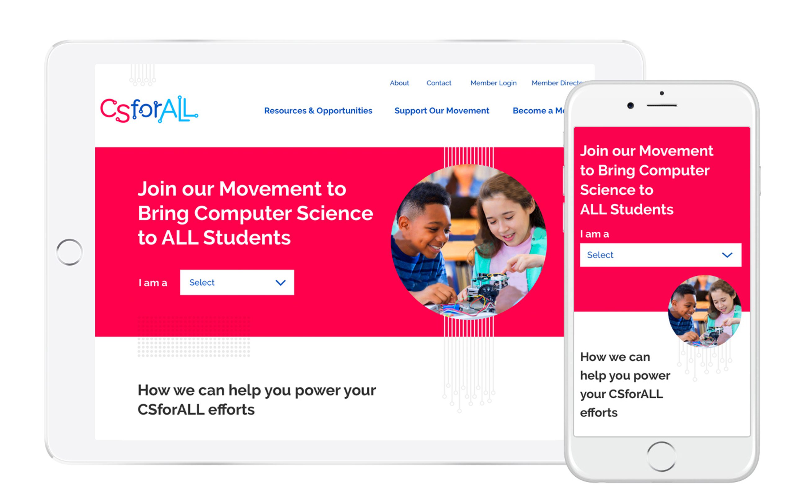
The visual brand is consistently and thoughtfully expressed throughout csforall.org
Every page that has your branding applied communicates the visitor is interacting with you. This minimizes confusion. Visitors aren't left wondering if they're engaging with the same organization as they navigate.
Beyond consistency, there is also quality. A polished visual presentation builds trust. The look of the website should match the quality of the work you do. Your web design should inspire confidence in your team and in those you support and represent.
Review your website and branded experiences.
- Does your visual brand express the level of quality of your organization's work?
- Is your brand presented consistently throughout your website?
- What about your donation, email signup, and volunteer forms? Is your brand presented consistently there as well?
Mindful Use of Animation
Animation can be a powerful website tool when used thoughtfully. A subtle animation can direct a visitor's eyes towards an important call-to-action.
Excessive or unrelated animations can distract and deter engagement. If every header, image, and paragraph animates as one scrolls, how does anything stand out? Animation can become noise if not done well. Too much animation can be a distraction that causes a visitor to think, what is important? and why did this just move?
Review your website.
- Are you using animation on your website?
- Is it targeted and thoughtful? Is everything animated?
- Does your animation have the potential to cause a visitor to get distracted and/or think?
Seamless Donation and Signup Experiences
A user's decision to donate or sign up is a critical moment. When the process of completing that action is intuitive, it reinforces your brand and builds trust. Any hiccups or convoluted steps introduce friction, making users pause to think. This friction leads to abandonment.

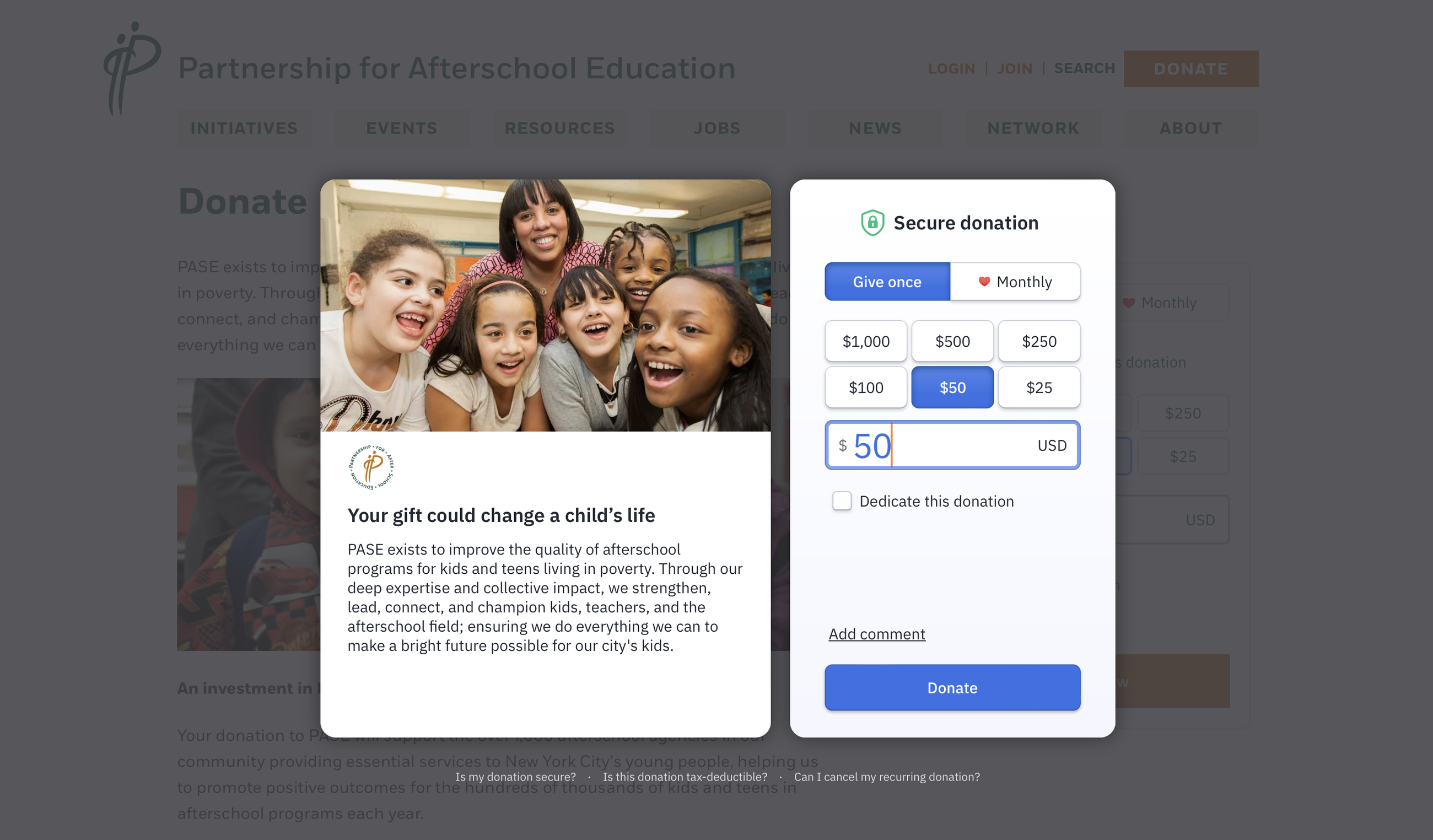
Pasesetter.org uses Fundraise Up to deliver a branded and modern experience directly on their website
When someone opts to donate or sign up, a clean, well-designed form will boost donor trust.
Similarly, the features of the experience matter. If a prospective donor starts a donation on a phone but can't use Apple or Google Pay, that creates an unwanted pause and friction. They may not have their credit card, or take the time to use it. You are creating a moment where they have to make another small decision about proceeding. This is an example of one of many forced moments of thought that can get in the way of a complete donation or form completion. A modern and brand-forward donation platform is key.
Review your donation process.
- Is the form really long and daunting to complete?
- Consider the impact of asking for custom information. Do you only ask for what you really need and will actively use?
- Can you ask for additional information after the donation transaction is complete?
- Do you allow for modern payment options (Apple Pay, Google Pay, and Venmo for example)?
- Is the form nicely designed? Does it properly reflect your visual brand?
- Does the form live on your website?
Review your email sign up forms.
- Do you only ask for information that you will use for segmenting or personalization?
- Is the form nicely designed? Does it properly reflect your visual brand?
Conclusion
The digital landscape has evolved since Steve Krug first introduced the "Don't Make Me Think" principle. Yet, its essence remains unchanged, especially for nonprofits. Making your website intuitive and user-friendly is more than a design choice. It's a way to ensure that your mission resonates, your message is heard, and your audience feels connected and compelled to act.
Applying this principal takes practice and discipline. You really have to experience your website with fresh eyes. This, and through the eyes of a new website visitor of an audience you want to engage and/or serve.
At Minds On Design Lab, we weave the "Don't Make Me Think" philosophy into every project. We know the importance of creating digital spaces that are both beautiful and intuitive.
More Articles
- Build your brand
The Visual Brand Audit: Does your look match the quality of your work?
- Improve your website
Are your nonprofit homepage headers saying nothing?
Ideas for small teams doing big things in the social sector
Subscribe to get ideas that blend design, strategy, and technology to help you build your brand, improve your website, and strengthen your communications and fundraising.
SubscribeBrought to you by MOD-Lab
At MOD-Lab, we're the thoughtful design partner for small teams like yours doing big things in the social sector. We create memorable branding, design materials, and websites that showcase the quality of your work and reflect your true impact.


