Coast Guard Foundation Branding and Website


Exploring Old and New
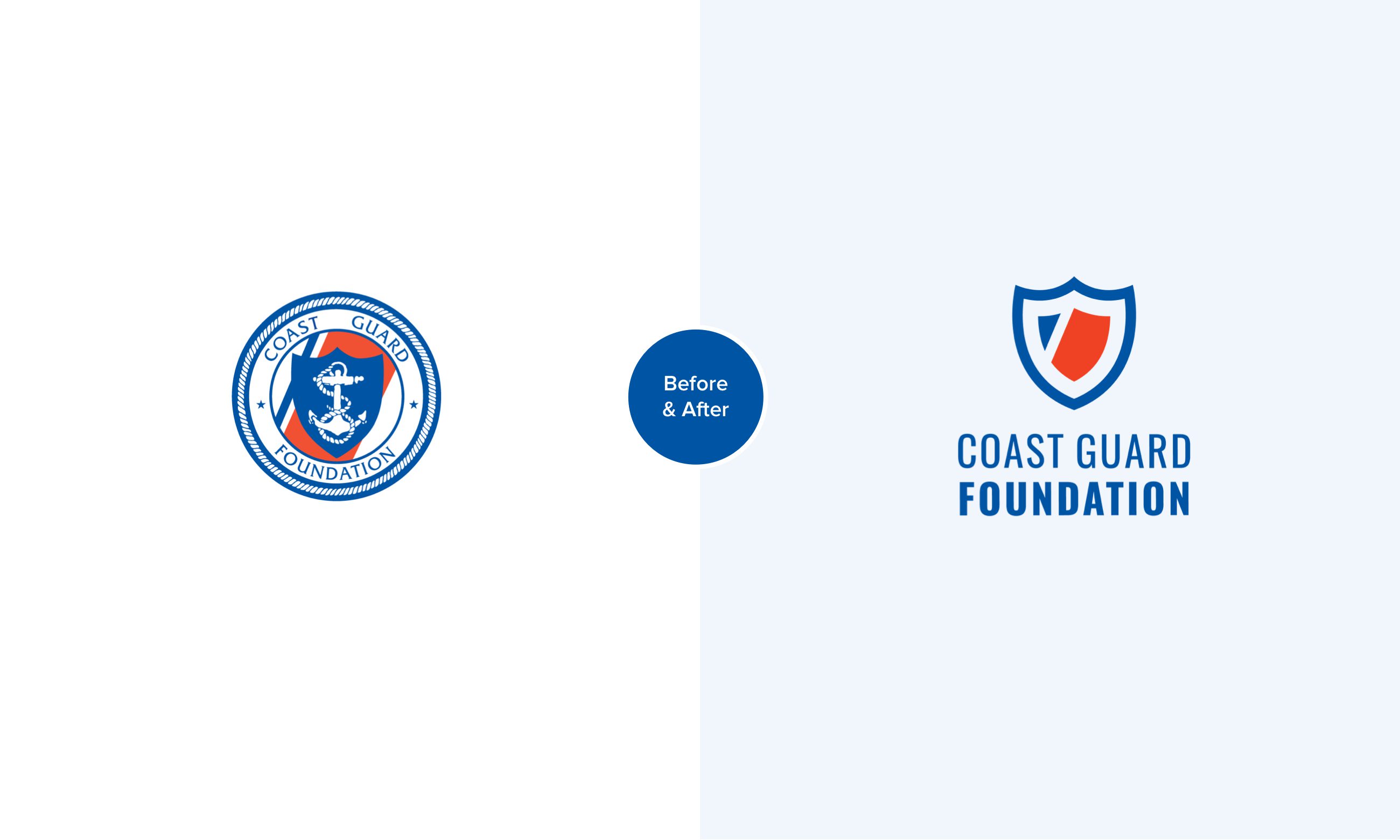
It was important that our work honor the history of the organization and the previous logo. We were challenged to give them something new while retaining old elements. We explored various design directions incorporating the shield, stripes and star elements in a new way.
Their old logo had a lot of detail that was challenging to work with in some media. Part of our effort was to ensure we delivered a simpler, more versatile logo.

Final Logo
The new Coast Guard Foundation logo is made up of two shields that together create a powerful symbol of support, protection and community. The inner shield represents the Coast Guard members. The outer shield represents the Foundation.
The iconic Coast Guard stripes make up the inner shield, providing a clear tie to the Coast Guard. The word Foundation is bold, visually supporting the words Coast Guard.
This logo has a tone of confidence. A solid, supportive foundation.


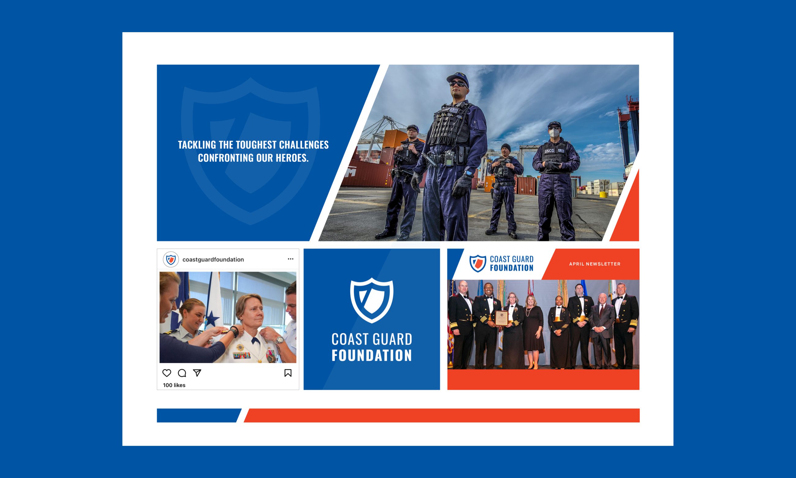
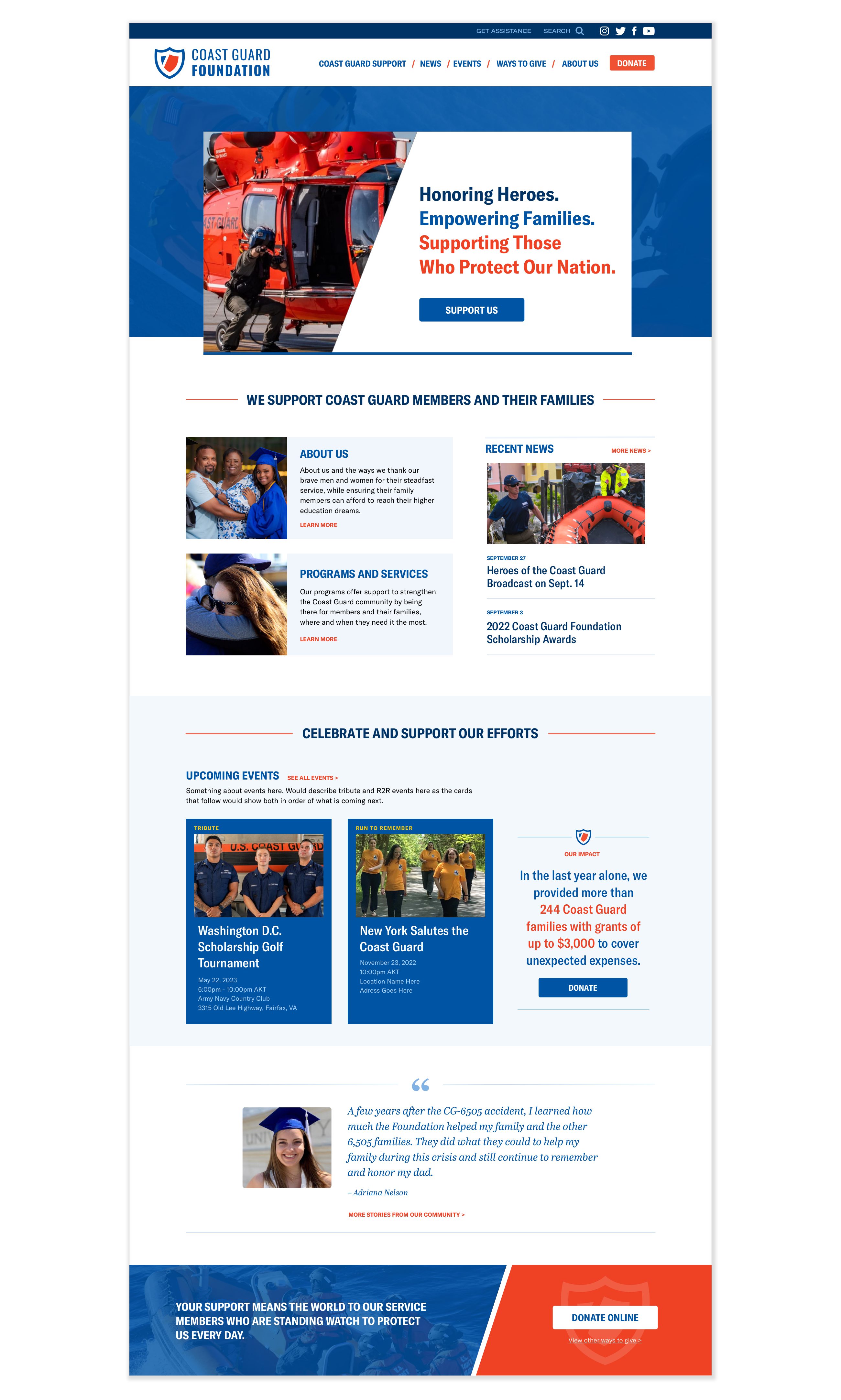
Coast Guard Foundation's visuals have been overhauled thanks to the work of MOD-Lab. Our logo was beautifully redesigned and website too. We've received great feedback from our board and supporters on the new look, and our logo redesign has has given us the ability to clearly unify the Coast Guard Foundation brand across our online and offline initiatives.
- Christopher McBriarty, Director of Digital


